The Visual Evidence Gap: How to Make Short-Form Videos Show What Their Scripts Claim

A short-form video explains how a small business reduces delivery delays. The narration describes a faster order process, but the screen shows a generic person typing on a laptop. The image looks professional, yet it does little to help viewers understand the actual process.
This is the visual evidence gap: the difference between what a video says and what its audience sees.
A strong script cannot carry the entire message by itself. The visuals should help explain the narration, demonstrate important ideas, and give viewers a clearer picture of what the words mean. When the two work together, a short video becomes easier to follow. When they do not, even polished content can feel disconnected.
Why Narration and Visuals Need to Work Together

Viewers process spoken information and visual information at the same time. If the narration explains one thing while the screen presents something unrelated, the audience has to work harder to connect them.
Imagine an educational video explaining how water moves through a plant. Showing a random garden photograph may establish the subject, but it does not explain the movement. A simple illustration showing water traveling from the roots through the stem communicates the actual idea.
The CDC's Clear Communication Index guidance on visuals recommends making sure that words and visuals communicate the same message and reinforce one another. It also warns against visuals that are unrelated, unclear, or contradictory.
The objective is not to make every frame a literal representation of every spoken word. It is to ensure that the visual contributes to the meaning.
Show the Meaning, Not Just the Keyword
One common production mistake is choosing an image because it contains a word mentioned in the narration.
For example, a video says, "Businesses can improve customer retention by responding to feedback." A creator searches for an image of a customer and selects a generic smiling person. The image matches the word "customer," but it does not explain retention or feedback.
A more useful visual might show a customer submitting feedback, followed by a business reviewing it and making an improvement. The sequence illustrates the relationship between listening and responding.
Before selecting a scene, ask:
What is the main idea of this sentence?
What relationship or action should the viewer understand?
Would this visual make sense if the narration were temporarily muted?
Does the image add meaning, or does it simply repeat a keyword?
This small change in thinking can improve visual storytelling considerably. Instead of searching for pictures that match individual words, creators begin looking for visuals that communicate complete ideas.
Match the Visual to the Type of Message

Different messages require different visual approaches. A useful scene should reflect what the narration is trying to accomplish.
Explanations: When describing how something works, show the components and their relationship. A tutorial about an online booking process could use a sequence showing a customer selecting a date, confirming a reservation, and receiving confirmation.
Comparisons: When the narration contrasts two options, make the differences visible. A video comparing manual and automated reporting could show two clearly labeled process flows rather than unrelated office photographs.
Instructions: When explaining a task, use visuals that demonstrate the action in the correct order. If the narration explains how to prepare a document, show the relevant stages instead of a generic desk scene.
Statistics: When presenting numerical information, use a chart, highlighted figure, or simple comparison that accurately represents the numbers. A decorative image of a growing arrow should not replace the actual data.
Examples: When introducing a real-world situation, show an appropriate illustration or scene that helps viewers recognize the circumstances being described.
The University of California San Diego's multimedia learning principles explain why relevant images and spoken explanations should be designed together. Visuals that do not support the learning objective can create unnecessary distraction.
Make Abstract Ideas Visible
Some messages cannot be filmed directly. Concepts such as efficiency, cybersecurity, customer satisfaction, or financial risk are not physical objects that a camera can simply capture.
That does not mean creators should rely on random stock-style imagery. Abstract ideas can be communicated through carefully chosen visual representations.
For example:
Efficiency: Show several steps becoming a shorter, more organized process.
Cybersecurity: Use a simple illustration of information moving through a protected digital connection.
Financial risk: Show a clear comparison of potential costs or a visual representation of changing exposure.
Team collaboration: Illustrate separate contributions coming together into one completed project.
These representations are visual explanations, not documentary proof. A shield icon can symbolize protection, but it does not demonstrate that a real system is secure.
The World Health Organization's visual communication guidance also highlights the value of illustrations and graphics for explaining technical information, processes, and relationships.
Avoid Visuals That Suggest More Than the Script Says
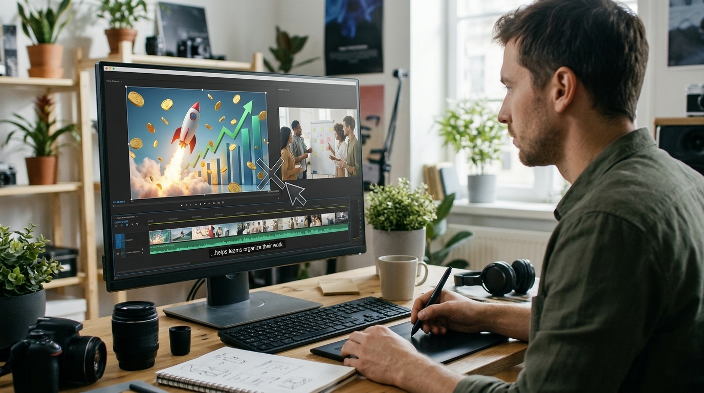
A visual can be attractive and still communicate the wrong message.
Suppose a business video says that a new service can help teams organize their work. Showing a dramatic image of a company doubling its revenue could imply a financial result that the narration never establishes.
The same problem appears in educational and informational content. A video discussing a possible health benefit should not use imagery that suggests a guaranteed cure. A product explanation should not show an interface or function that the product does not actually provide.
Check whether the visual introduces an unsupported claim, exaggerates the narration, or changes the meaning of an example. If it does, replace it with a more accurate representation.
Visuals should clarify the message, not quietly make stronger claims on its behalf.
Give Every Scene a Purpose
Before accepting a scene, identify the job it performs. A useful visual generally does at least one of four things:
Explains: Makes an unfamiliar concept easier to understand.
Demonstrates: Shows an action, process, or sequence.
Contextualizes: Helps viewers recognize the situation being discussed.
Reinforces: Makes an important point easier to remember.
A scene does not need to be complicated to be useful. A simple diagram may explain a process more effectively than an elaborate animated background.
If a scene performs none of these functions, ask whether it is necessary. Sometimes a brief transition is appropriate, but repeated decorative imagery can make a video feel busy without improving its message.
Review the Video as a Viewer
Writers and creators know what they intended to communicate. That familiarity can make mismatched visuals difficult to notice. Reviewing the finished video from the audience's perspective helps reveal the problem.
Try this scene-by-scene method:
1. Read the narration first. Summarize the main idea of each sentence or section in a few words.
2. Watch the corresponding scene. Identify what the viewer actually sees, not what you intended the image to represent.
3. Compare the two messages. Does the scene explain, demonstrate, contextualize, or reinforce the narration?
4. Look for misleading implications. Check whether the image suggests unsupported results, features, statistics, or events.
5. Replace weak scenes. Choose a more relevant illustration, comparison, process sequence, or example.
6. Watch the complete video again. Make sure the visual sequence develops logically alongside the narration.
This review does not require advanced editing skills. It requires asking whether each scene earns its place in the video.
How AutoReels Fits into Visual-Narrative Alignment
AutoReels.AI helps creators produce short-form videos through an AI-assisted workflow. Its AI video generator generates a script, visuals, voiceover, and burned-in subtitles from a topic or custom prompt. Users can choose an image style and voice, then review the generated result.
The AutoReels production workflow also includes previewing the first video and making available changes to the prompt, title, description, or voice before regenerating.
These capabilities can help creators move from an idea to a finished short video, but generation is only part of the process. Review whether the generated imagery actually communicates the intended meaning. If a scene feels unrelated, misleading, or too generic, reconsider the prompt and the content before publishing.
AI can support production, but editorial judgment remains essential. A generated visual should never be treated as proof of a real event, product capability, or factual claim simply because it appears convincing.
The Visual Alignment Checklist
Before publishing, ask:
Does each scene support the corresponding narration?
Do visuals communicate ideas rather than simply repeat keywords?
Are instructions and processes shown in a logical order?
Are comparisons and statistics represented accurately?
Do abstract illustrations make the message easier to understand?
Could any image create a misleading impression?
Does every scene have a clear purpose?
Does the complete video communicate one coherent message?
Conclusion: Make Every Scene Part of the Explanation
Short-form video is not simply narration placed over attractive images. It is a combination of spoken and visual information that should work toward the same message.
When creators choose scenes based on meaning, represent abstract ideas carefully, and review every visual against the script, they close the gap between what a video claims and what viewers actually see.
Whether you create educational explainers, product videos, tutorials, or social media content, make every scene contribute to understanding. With AutoReels or any other production workflow, the final question should always be the same: does the viewer see what the narration is trying to say?